

And have been for six months. This chart may seem unbelievable or impossible, but it's correct, based on weekly data from the British government.

Visit and follow us on Instagram at @crg_globalresearch.
***
The brown line represents weekly deaths from all causes of vaccinated people aged 10-59, per 100,000 people.
The blue line represents weekly deaths from all causes of unvaccinated people per 100,000 in the same age range.
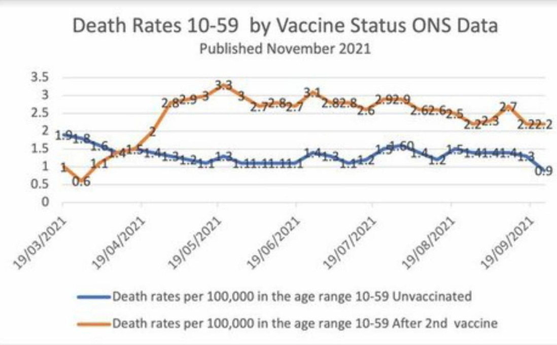
I have checked the underlying dataset myself and this graph is correct. Vaccinated people under 60 are twice as likely to die as unvaccinated people. And overall deaths in Britain are running well above normal.
I don’t know how to explain this other than vaccine-caused mortality.
The basic data is available here, download the Excel file and see table 4.
*
Note to readers: Please click the share buttons above or below. Follow us on Instagram, @crg_globalresearch. Forward this article to your email lists. Crosspost on your blog site, internet forums. etc.
Featured image is from NaturalNews.com
https://www.globalresearch.ca/vaccinated-english-adults-under-60-dying-twice-rate-unvaccinated-people-same-age/5762415


No comments:
Post a Comment